The Problem With Giant Stock Screener Filter Menus
A stock screener with hundreds of filters is slow to search and hard to trust. See why filter menus keep growing and what a scanner can offer instead.
Open a serious stock screener and you meet the menu: tabs, categories and dropdowns holding hundreds of filters. Trade Ideas lists 249 filters. Stock Rover advertises more than 800 metrics. The size is meant to reassure you that whatever you need is in there somewhere.
Often it is. The problem is the "somewhere", and what happens when it is not. This post looks at the filter menu itself: why it keeps growing, what it costs you to use, and what the alternative looks like. We covered a related point in why more filters do not mean more flexibility. This one is about the day-to-day cost of working from a very long list.
Why stock screener filter menus keep growing
A filter is one fixed question, such as "price above X" or "gap above X%". Every new kind of question a trader asks needs a new entry in the menu. That is where the growth comes from.
Take a screener with 20 fields. Comparing each field with a number takes 20 filters. Traders then want the same fields on 1-minute, 5-minute and daily bars, so the vendor adds a filter for each timeframe. Then they want to compare fields with each other, such as price against VWAP or volume against average volume, and every pair needs its own entry.
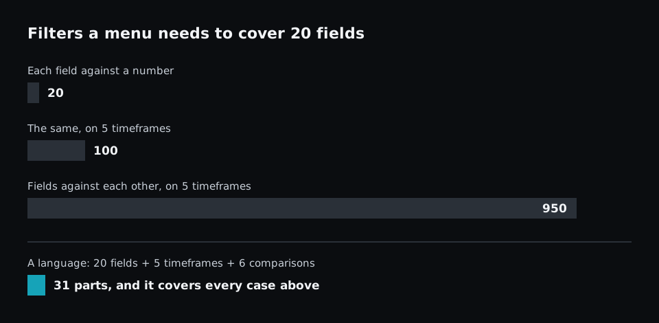
The numbers are simple arithmetic, not a count from any real product. Twenty fields make 190 possible pairs, and five timeframes make that 950. No vendor ships all of them. They ship the combinations most people ask for, which is why a menu can hold hundreds of filters and still lack the one you want.
So a giant menu is not a sign of a careless design. It is what happens when every question has to be written in advance.
Four costs of a giant filter menu
Finding the filter takes time
The more options a list has, the longer it takes to choose from it. Psychologists call this Hick's law. In a screener it shows up as scrolling through categories, guessing whether "gap" lives under Price, Technical or Session, and typing three different words into a search box.
There is also the well-known jam study by Iyengar and Lepper, where shoppers offered 24 jams bought far less often than shoppers offered 6. That result has not always held up. A later meta-analysis of 50 experiments found the average effect of choice overload was close to zero, with a lot of variation between studies. So it is fair to say that more options cost search time. It is less certain that they stop people choosing at all.
Similar names hide different definitions
A long menu usually has several filters that sound alike: volume today, average volume, relative volume, volume in the last 5 minutes, unusual volume. The names are short and the definitions are not on the screen.
Definitions also differ between platforms. Finviz describes relative volume as current volume divided by the 3-month average. Trade Ideas compares today's volume with the average for the same time of day. Both are reasonable, and a threshold of 2 means something different in each. If you set a filter without reading its definition, you may be asking a different question from the one you think you asked.
The nearest filter is not your setup
Most of the work in a filter menu is translation. You have a setup in your head and you look for the entries that come closest.
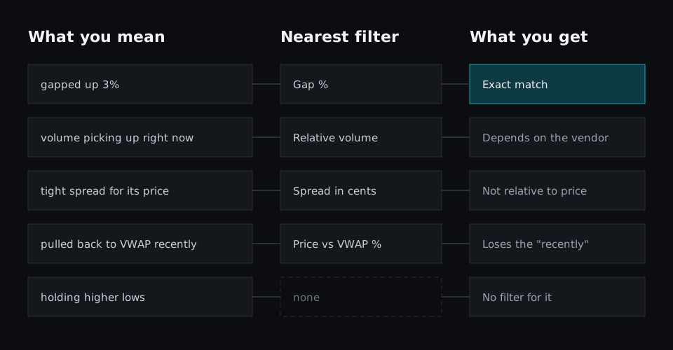
Some phrases translate exactly. Others land on a filter that is close: "tight spread for its price" becomes a spread in cents, which treats a $3 stock and a $300 stock the same way. "Pulled back to VWAP recently" becomes a distance from VWAP, and the word "recently" is lost. Some phrases have no filter at all.
Each of these swaps is small. Together they mean the scan you built is a neighbour of the setup you trade, and you make up the difference by checking charts by hand.
A saved filter list does not explain itself
A scan built from a menu is saved as a list of settings. A month later the list shows what was switched on. It does not show which settings were the idea and which were housekeeping.
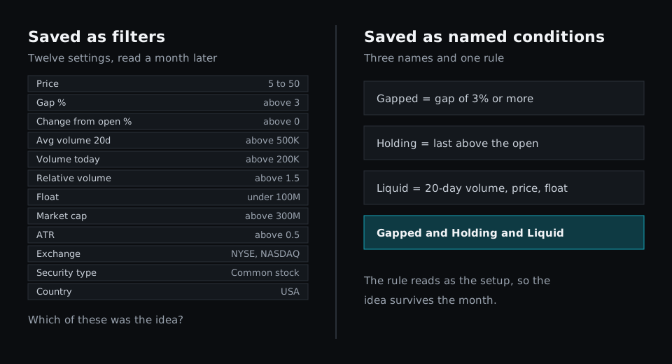
That makes scans hard to maintain. When results dry up, you do not know which of twelve settings to loosen. It also makes them hard to share, because the person you send it to sees the settings without the reasoning.
What to use instead of a giant filter menu
The alternative is a small vocabulary that combines, instead of a long list that does not. Four kinds of parts cover most setups:
- Fields: price, volume, bid, ask, VWAP
- Windows: a stretch of past bars, such as the last 20 days or the last 10 minutes
- Comparisons: any value against any other value, not only against a number
- Names: a label for a condition, so you can read it and reuse it
With those parts, the menu does not need an entry for "price against VWAP on 5-minute bars". You write it. This is the same idea behind the formula editors and scripting layers that many platforms have added on top of their filter lists.
Take two phrases from the diagram that the menu could only approximate. In Fastur each one becomes a short named condition:
logicblock Tight = quote.ask - quote.bid < trade.last * 0.002
logicblock VwapPullback = m1.low[1:10].min < d1.vwap * 1.002
Tight is a spread under 0.2% of the price, so it scales with the stock instead of treating a $3 name and a $300 name alike. VwapPullback keeps the word "recently": the lowest low of the last 10 minutes came within 0.2% of VWAP or below it.
The rest of the setup is built the same way. The gap, the volume pickup and the higher lows each get one named line, and the rule joins the names with and, so it reads like the sentence you started with. Nothing had to exist in a menu first. The scripting docs list the fields, windows and studies available.
Writing a script is not the only way in. In Fastur you can describe the setup in plain English and have the assistant write it, then read the result to check it says what you meant. A condition you use often can be saved as a named LogicBlock and picked from your own short list.
When a long filter menu is the right tool
Menus have real strengths. For fundamental screening, where the questions are "revenue growth above 20%" or "debt to equity under 1", a long list of fields is exactly what you want, and browsing it is a good way to discover measures you had not considered. A menu also has no syntax to learn and no way to write a formula that is subtly wrong.
The costs show up for intraday setups you run every day. That is where you repeat the search, live with the nearest-filter compromises, and come back to the same saved scan for months.
How to judge a screener by more than its filter count
A filter count tells you how long the menu is. These questions tell you more:
- Can I compare two values with each other? Price against VWAP, volume against its own average.
- Can I see how each filter is defined? Especially relative volume and anything with "unusual" in the name.
- Can I name a condition and reuse it? That is what keeps a scan readable.
- Can I say when? Time of day and "in the last 10 minutes", which we covered in why time-based conditions matter.
The takeaway
A giant filter menu is what you get when every question has to be listed ahead of time. It costs you search time, it hides definitions behind short names, it swaps your setup for its nearest neighbour, and it saves scans that are hard to read later. Before you count filters, write your setup as one sentence and see how much of it survives the translation. For the wider checklist, see the essential features of a modern stock scanner.
